
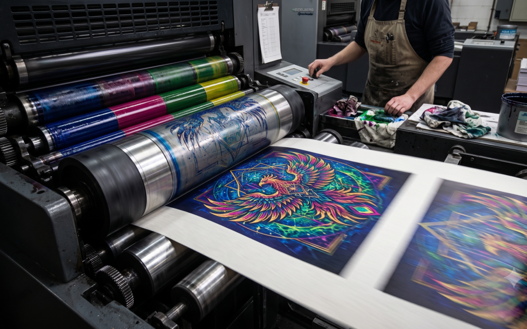
Why Your AI Art Looks Terrible on Paper (And How We Fix It)
You know the feeling. You spent hours tweaking the perfect prompt, adjusting weights, and re-rolling variations. Finally, in less than 30 seconds, Your Ai spits out an absolute masterpiece. The composition is flawless, the lighting is cinematic, and the colors practically leap off your monitor.
You send it off to a printer, excited to hang this gorgeous piece on your wall or plaster it across your brand’s new packaging.
Then the physical print arrives.
The vibrant cyberpunk neon looks like a bruised plum. The crisp, intricate details are slightly blurry, jagged, or weirdly soft. The image doesn’t quite fit the canvas, leaving awkward white bars on the sides. You realize, with a sinking feeling, that your digital masterpiece looks undeniably amateur in the real world.
You aren’t alone. Taking AI-generated artwork from a glowing screen to physical paper is fraught with technical pitfalls. Here is exactly why your AI art is struggling in the physical world and the science of how we fix it.
The DPI Gap: Why Screen Resolution Fails in Physical Print
The most immediate killer of printed AI art is resolution.
When you look at an image on a phone or laptop, your screen requires very little pixel density to look sharp usually around 72 to 96 DPI (Dots Per Inch). Because screens blast light directly into your eyes, they can cheat the brain into seeing a crisp image with relatively little data.
Physical printers cannot cheat. To look sharp, standard commercial printing requires a minimum of 300 DPI.
Let’s do the math: A standard AI image outputs at 1024 x 1024 pixels. On a screen, that looks huge and detailed. But if you try to print that image at the required 300 DPI, your physical print can only be about 3.4 x 3.4 inches before it starts losing quality.
If you take that same 1024×1024 image and stretch it to fit an 18×24-inch poster, the printer has to invent missing pixels. The result is a pixelated, blocky, or blurry mess. While built-in AI upscalers exist, simply pushing a “2x upscale” button often introduces weird digital artifacts, plastic-looking textures, or structural distortions that ruin the original composition.
The RGB vs. CMYK Reality: Where Did My Colors Go?
The second major roadblock is color space. Your monitor creates colors using RGB (Red, Green, Blue) light. By mixing these glowing lights, your screen can produce a massive, vibrant spectrum including pure, glowing neons and incredibly bright whites.
Printers, however, do not use light. They use physical ink: CMYK (Cyan, Magenta, Yellow, and Key/Black).
This is a fundamental shift from an additive color model (adding light to get white) to a subtractive one (adding ink to get black). The CMYK color gamut (the total range of reproducible colors) is significantly smaller than RGB.
When you send an RGB image to a commercial printer, their software will aggressively force those glowing digital colors into the smaller CMYK box.
-
That glowing neon blue? It becomes a flat navy.
-
That vibrant, electric pink? It turns into a muted magenta.
-
The deep, rich shadows? They often pool into a muddy, undefined black blob.
Because AI generators natively spit out highly saturated RGB images tailored for screens, printing them without a professional color conversion guarantees a dull, lifeless final product.
The Flat File Problem: The Curse of the Single Layer
Designers need flexibility. If you are printing a book cover, a product label, or a t-shirt, you rarely just slap a square image onto the medium. You need to adjust the layout, move the focal point, add typography, or remove the background.
AI gives you a flat, single-layer raster file (a JPEG or PNG).
-
The Bleed Issue: Commercial printing requires a “bleed”—an extra 1/8th of an inch of artwork around the edges that gets trimmed off to ensure the ink goes all the way to the edge of the paper. If your AI art has crucial details right at the edge of the frame, they will be sliced off.
-
The Typography Problem: If you try to overlay text onto a busy, flat AI background, the text becomes illegible. Without layers, you can’t easily slip a darkening gradient behind the subject but in front of the background to make your text pop.
-
The Apparel Issue: Want that cool AI skull on a black t-shirt? Because it’s a flat file, it prints with an ugly digital black box behind it, rather than blending seamlessly into the fabric.
The DRS Crew Solution: Bridging the Digital-to-Physical Divide
At DRS Crew, we know that hitting “Generate” is only step one. Taking that raw, untamed digital file and engineering it for premium physical production is an entirely different discipline.
We don’t just run your art through a cheap upscaler and hope for the best. We treat your AI output like raw material. Here is how we make your print match your vision:
1. Intelligent Deconstruction We don’t just leave your file flat. Using advanced masking and isolation techniques, we deconstruct your AI art into workable layers. We separate the foreground subjects from the background, allowing us to adjust layout, generate the necessary bleed margins, or isolate elements for transparent apparel printing.
2. Precision Color Correction (RGB to CMYK) We stop the muddying before it happens. We manually convert your artwork into the correct print color profiles. Instead of letting a dumb printer algorithm crush your vibrant colors, we selectively adjust the saturation, contrast, and color balance to mimic the glowing look of the screen as closely as physically possible with ink.
3. Artifact-Free Upscaling & Formatting We utilize specialized, multi-pass upscaling workflows that multiply your resolution without turning the details into plastic. We then format the final file to exact printer specifications—including safety zones, bleed marks, and the correct resolution—so your 18×24 poster looks just as crisp as the image on your phone.
Don’t let a technical gap ruin your creative vision. Generating the art is your job. Making sure it looks incredible in the real world is ours.
Ready to see what your AI art really looks like on paper? Contact the DRS Crew today, and let’s get your files print-ready.
TL;DR: Why AI Art Fails in Print (And How to Fix It)
AI-generated images from tools look incredible on screens but often print poorly because they are optimized for digital displays, not physical ink. To successfully print AI art, you must overcome three technical barriers:
-
Resolution (The DPI Gap): AI images generate at screen resolution (72 DPI). Printing requires 300 DPI, meaning raw AI files will look blurry or pixelated if enlarged without professional upscaling.
-
Color Space (RGB vs. CMYK): Screens use glowing light (RGB) to create vibrant colors, while printers use physical ink (CMYK). Without precise color correction, vibrant digital neon’s will print dark and muddy.
-
Flat Files: AI generates single-layer images. For professional layouts, packaging, or apparel, these files must be manually deconstructed into editable layers to add text, transparent backgrounds, or print bleeds.
The Solution: Before printing, AI art must be professionally upscaled, converted to a CMYK color profile, and formatted. The DRS Crew handles this entire technical conversion process so your final physical print perfectly matches your original digital vision.
Quick Answers: Prepping AI Art for Print
Why does my AI generated art look blurry when printed?
AI generators typically output images at 72 DPI, which is optimized for screens. Commercial printers require a minimum of 300 DPI. When you print a low-resolution AI image at a large physical size, the printer stretches the pixels, resulting in a blurry or pixelated image.
Why do the colors in my AI art look dark and muddy on paper?
Digital screens display colors using RGB (Red, Green, Blue) light, which allows for highly vibrant, glowing colors. Printers use CMYK (Cyan, Magenta, Yellow, Black) ink, which has a much smaller color range. If you do not properly convert and color-correct an RGB file to CMYK before printing, vibrant digital colors will become dull, dark, and muddy.
Can you print AI images on a canvas or poster?
Yes, but the raw file must be modified first. A standard AI generation is 1024×1024 pixels, which only prints clearly at about 3.4 x 3.4 inches. To print on a large canvas or poster, the image must be professionally upscaled, converted to a CMYK color profile, and formatted with proper bleed margins.
How do you fix a flat AI image for product design?
Because AI generates flat raster images, they lack editable layers. To use AI art for apparel, packaging, or typography layouts, the image must be manually deconstructed using masking tools to separate the foreground subjects from the background. This allows designers to add text, adjust layouts, or print on transparent backgrounds.